Friday, January 27, 2012

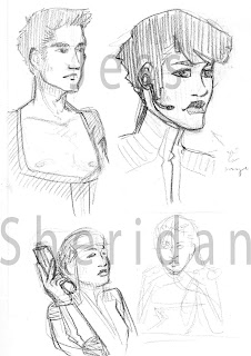
Liz

I'm making an effort to post here more often, even if it is only sketches. I hope you like sketches and don't think I'm some sort of crazy person and/or lazy.

Liz - "Heart of the Self"
Inspirations - big headphones, cyberpunk, Tima from Metropolis, Motoko Kusanagi from Ghost in the Shell, that professor with the robotic legs that Vary likes in Finder, probably every robot/cyborg/mechanically based entity in any sci-fi I've ever fallen in love with (at least the conscious ones)
This afternoon
Red Col-erase
More designs for the robot girl (who I'm now calling "Liz") from last post. She's slowly becoming an homage to every one of my favourite robots/cyborgs - lets hope that EVAs don't make their way into this mix, especially not unit 01. The whole hair like Kusanagi was unintentional, but I will definitely acknowledge it as a subconscious association of one robot girl angsting about the self with another. 
The name Liz is, of course, short for Elizabeth. The girl she's based off of usually went by Liza or Lizzie. That won't ever be mentioned in the story (since the story doesn't have words), but I thought that that bit of information was interesting.

Tuesday, January 24, 2012

Class doodles

I draw a lot in class (because I am the BEST student). I haven't posted any doodles for a long time. Here's some from today's batch!

Working title "Heart of the Self"
Inspirations - Tima from Metropolis
Pen
Bunch of character designs for a short comic story that I'd like to work on once I finish Rowan; the story is based off a short story written for class in November/December which I couldn't realize despite writing it about 4 times. I eventually realized that the reason why I couldn't get it right was because I thought it in images. Obviously I have to write it in a comic instead! Little tidbit about the story: its about a robot girl built to replace a dead daughter (parents in the middle). No text, completely picture based.
Mostly just one character/versions of the same character. The little pic on the right is, just fyi, not inspired by either the Terminator or Two-Face; she's a bit of an homage to Tima from the animated epic Metropolis based on Tesuka's graphic novel series of the same name and the famous silent film. I think the image on the left describes her the best.

Character designs for "All Hail" backstory
Pen
Designs for Amelia and Rodrigo (both can be seen in earlier posts) when they were much younger (23 and 50 respectively). I've been writing a short story for class about them at this point in their lives and wanted to get a good handle on their visuals (it really helps me to have a visual concept of characters, places, etc. prior to writing anything). The two images flanking both sides are of Amelia's mother, Talia. Her mother never shows up in the story, but, again, I like having a good idea of what she looks like. Her mother died very young, hardly into her thirties, which is why she looks so young here.

Saturday, January 21, 2012

Oh look! SOMETHING NEW. Who would have guessed?

Still working away on the dhoti lady. At a bit of an impasse since all that's left is painful detail work. I watched The Adventures of Priscilla Queen of the Desert tonight instead of working on comic pages/covers (I intended to do both, but the movie was far more entertaining than I expected). At the very end of the movie Guy Pierce, whose queen performance will haunt me as I try and watch Prometheus in couple months, was wearing these horrible, horrible checkery stripey pants for one shot and this was born.
Inspirations - Guy Pierce's pants in Priscilla, high fashion (been reading "Hello, Tailor" lately), Harlequins, Hamletmachine and her lovely use of checkers
Jan 21st/22nd
2 hours, photoshop CS5
I learned how to use clipping masks about a week or two ago. It's made my life so much easier. There are like 5 or 6 masks on this to do shading and what not. Lots of gradient abuse too. I feel like her face and hair really stick out. Might fiddle with her some more in the morning.
Started out as just a fashion thing and somehow she became a magic user. Balanced the drawing better.
EDIT: Fixed the hair. I've added the new version as well. I'm not sure exactly which I prefer. The new version looks very punk (I worry that it's too cliche even though it works a lot better).

Sunday, January 15, 2012

Almost done

Yup. More of her; I'm obsessed with her right now. She's almost done, just need detail work (so much pattern work and mehndi to do!), background, and a few other things now. I was originally going to fully render her, but I like the cell shading effect on her, especially the arms. Still adjusting a few things to make sure everything's perfect. Once done I'm hoping she can be a good portfolio piece for the upcoming horror that is graduation and job hunting. I promise that the next post containing her will be the last and that you'll see new things soon (well, as "soon" as soon can be for me).

Thursday, January 12, 2012

Dhoti lady again

Inspirations - cont. from last night's list, buddhist paintings, a pair of sandals from the Bata Shoe Museum (do not remember the proper name for the specific sandal), the Inception movie posters, Hugo's automaton with the key
Working on her again tonight. Adjusted her skin and feet position, added a lot. I need to look up mehndi designs for her feet and hands. Also fish patterns for around her feet. Very pleased with this thus far. I'd like to finish her over the next couple of days since soon I'll be in hard core comic mode. The guys might kill me soon if I don't submit more comics. I'm not sure if those pants are physically possible. We're going to ignore the proper ways of tying dhoti and pretend that these work by some magical manner. Artistic license abuse.

Wednesday, January 11, 2012

Mini post (again)

Class has started! Not sure yet if this is a good thing or a bad thing for amount of drawing, though, honestly, nothing can be worse than last semester's drawing nothing very little. Tonight was coffee sketch time, I drew things. I didn't get much done. I have no idea how certain people can draw so much while talking with others. I can't really do both. If I'm drawing I'm drawing and really intense and scary.

Inspirations - feet, dhoti, the Mucha poster on my wall, Finder by Carla Speed McNeil, sci-fi
Jan 9th or something like that for the original drawing and tonight for the colour
I have an immense love for Indian/Hindu clothing; if that wasn't obvious by now, now you know. It boggles my mind that such intricate clothing can be created from a single piece of wrapped cloth. I've also been reading the Finder series. I love the designs for the Ascians and Vary. I have also, if you were wondering about the listing of "feet", recently noticed the pink tones on the bottoms of pale feet and how pretty they are. I've probably noticed this before, I've just never been conscious of it. Since the clothing is Indian based it would make sense for the girl to be a lot darker, but then I wouldn't be able to draw cute pink feet. Her skin might change, feet covered in medhi (where the hell does the h go?) and the pink feet saved until later. So,  anyways, here's the love child of all those things (and the Mucha lady whose name I don't know). 
It will eventually have a bit of a sci-fi twist. I left the sketchbook with the original drawing at home and couldn't remember how it went (I drew the sketch at like 2am one night, so I hardly remember what I drew. Yes, I do most of my sketches traditionally. I do illustrations digitally because it's faster.). She'll have robotic arms and possibly other mechanical parts. Her upper clothing will be a lot more sci-fi with a very traditional bottom.
For those interested in Indian/Hindu clothing I highly suggest tracking down The Costumes and Textiles of India by Jamila Brij Bhushan. It's impossible to find, last printed in the 50s (when Mumbai was still called Bombay), and it's absolutely amazing. If that fails, look up the artwork of M. V. Dhurandar; a lot of the illustrations found in the text are his watercolour works. Whenever I want to draw or reference Indian clothing I go straight to this book. If you ever find a copy buy it, forget about the price, buy the thing. It's worth it. I'm very rambly tonight so I'm going to stop typing now and get some sleep.


One last thing, hello to the viewer from Germany. Yes, I pay attention to where my views come from (yours stand out from the Canada/US ones and are pretty regular). Thank you for following my blog (that also goes to the people who are not my German friend). I hope you enjoy my work. Are you a costume geek?

Monday, January 02, 2012

Tables Turned

So, I recently decided that I have an intense hatred for the portrayal of women in pretty much every modern medium. As both an artist and a writer (that second part is a bit sketchier) I decided that I should start a satirical comic series about all of the inequalities and down right stupid gender assumptions and constructs that I find infuriating. Here are a few rough sketches for the first comic done while at a coffee drawing thing with friends tonight.

Tables Turned 01 sketches
Inspiration - action movie posters, the 5 man band archetype
Jan 2nd
Col erase pencil 
I love action movies. They are so very, very bad and stupid but I adore them. The one thing that always gets me is that the girl (if there is one) is always clearly just there for T&A and completely brain dead. She's useless, and if she's not she'll be there for the "designated girl fight" against some femme fatale knock off. She will always, without fail, be wearing less than her male peers and/or her clothes will be a skin tight leather cat-suit. There are very few exceptions to this and it's pretty alienating being a girl who likes action films (or anything geeky really, read this article, Nerds and Male Privilege, if you're interested in the subject).
Anyways, the first comic in the series of Tables Turned is a gender swapped version of the 5 Man Band with the one guy as "the chick" complete with absurdly skimpy clothing. I still need to tweak a few designs (the top right woman's style in the second image really contrasts with the overall design) but I'm pleased with them thus far. I might reuse the woman with the long hair. Definitely one of the more interesting faces I've drawn.

I am totally aware that this project will forever brand me a feminazi, but seriously, when I (and a number of my female friends) can't enjoy a book or film without being alienated there's something wrong with societal norms.

I should also note, this blog is really not about costumes anymore. It needs a new name. I'll be thinking about that for the next little while. Any ideas?

Sunday, January 01, 2012

Year's End

Happy New Year one and all. Hope you had a good time last night and I hope your hangovers are not too difficult to deal with today. I've decided to do a big post to celebrate the end of one year and the beginning of another; the following will have bits and pieces from my backlog of art that I never got around to posting as well as what I consider the best of the year. Thank you to everyone who's visited this blog over the course of 2011! I look forward to the beginnings of 2012!

Backlog

Dec 30th 
Draw this while waiting for my plane to board. About 15 minutes, no references. I think it's pretty obvious that I had a big anime phase as a kid; her eyes are huge, haha. Clearly my favourite way of passing the time is drawing pretty ladies, because honestly, what else do people do with their time? Watch TV? Pfft.

Inspirations - an article in Times magazine
Dec 27 or 28th
While at home (Houston with the parents) I read an interesting article in Times discussing how there hasn't been a major shift in clothing over the last 20 years, which greatly contradicts the historical patterns. I have my own theories about this (including that fact that my generation has had everything handed to us on a silver platter, case in point: hipsters) but I found it interesting that no one's really tried to make a new style of clothing for the modern era. This is my take. Sci-fi infused clothing with poofy pants because skinny jeans, and jeans as a whole, need to go die in a fire. They're SO OLD and BORING. We really need a new pant style.

 
Girl with the Dragon Tattoo
August 2011
A friend of mine Kat (you can find her under wkobra on dA and blogspot) had a theme drawing week where each day we had to do at least one drawing (doodle to full illustration) based off of the day's theme. I did Noomi Rapace as Lisbeth Salander for films. Moderately successful; her mouth is off, as is the overall length of her face. Single colour and opacity on a white background.

Inspirations - birds, masks, blood
April 2011
4 layers, black background, white, two red (blood on hands and background red). I find it a lot easier to draw by thinking about form and then shaping it than line + fill. This was done by blocking everything out with white and then erasing to get the proper shape. This is related to All Hail; the mark at the bottom is one of my signatures (I go by "black koi" on a few websites).

Regina - Ghosts by Ibsen
Inspirations - taken primarily from a close reading of the text. The historical accuracy is so horribly off. Hair inspired by Wendy from Disney's Peter Pan.
January 2011
Watercolour, ink, pencil
1 of 2 illustrations for a class assignment back in January, Regina from Ibsen's Ghosts. I'm a huge fan of Ibsen, his work is so detailed and really lends itself to bold visual interpretations. The focus for Regina was that she was Oswald's "light" to save him from his venereal disease, she is, however, a child and cannot do these things for him. She's supposed to be a mild-mannered young woman, but she is easily tempted (flash of red after a certain scene). I'd like to revisit this design and make it more accurate (bustle is so off).

Oswald - Ghosts by Ibsen
Inspirations - same as Regina, Japanese kimono
January 2011
Watercolour, ink, pencil
2 or 2. Oswald is a failed painter whose primary characteristic is that his views are clouded and that he can no longer paint like he used to, at first this just seems like an artistic block but it is revealed that he's dying of syphilis like his late father. Red (lust) hidden by his artistic persona, a persona which is clouded (print on kimono). In the text he wears a smoking coat. I changed this to a kimono; they were trendy at the time. Colours to match Regina suggesting a connection between the two.

Summer 2010 - 2011
This was the first thing I drew when I started using photoshop. As I learned more about the program I worked on it more and more. I still visit it every so often to tweak things. A lot of it was just experimenting with brushes, painting styles, and the general mechanics of the program, which is why different parts are done in different methods. Painted over an old sketch from February 2010. Also related to All Hail, Alia from a previous post.

Faves of the Year


I'll hopefully be drawing some new things over the next week. I've got a week before school starts (yay!) but first I have to do some design work for my parents.