Sunday, December 30, 2012

Year's end

Little early but might as well post now! First something new to set the year off right,
An Art Nouveau (specifically Mucha) inspired illustration that I'll be submitting to Threadless for consideration. I'll post again once I submit and would appreciate any votes my few followers might be willing to provide (nudgenudgewinkwink).

Aaannnddd a compilation of my favourites from the year:


Tuesday, December 11, 2012

Ninja mage

More from the design challenges, 'mage' was this one's theme. Stayed away from the typical robes and went with dolman sleeves and drop-crotch pants. I intended for this to be pure silhouette but it ended up a lot more detailed; also intended for a more complex layering of clothing but the pose made that a bit difficult.

Thursday, December 06, 2012

Yzma

Another design challenge, redesign a famous movie or tv character. I chose Yzma from Disney's The Emperor's New Groove. In her original incarnation she looks far more like a flapper than an Incan witch/advisor. She had next to no common design elements with her fellow cast members and pretty much stuck out like a sore thumb despite being awesome.
Kept the colours and headdress (too iconic) and made her overall look fit in more with everyone else. Transitioned her gaudiness into more gold and accessories - it always seemed weird that someone so power hungry wouldn't be decked in gold. For the record, those spindly hands will haunt me for quite some time. The rest of the style wasn't too hard to emulate, but the hands!

Wednesday, November 28, 2012

More design challenge sketches


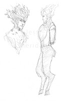
 Sketches for "leather" and "suits" challenges, both of which I'd like to return to. Still can't decide if the plant/deer man should have little breeches or not. I kind of like him all fuzzy.

Mini-illustration for "shorts". The original sketch was horrible so I redid her in photoshop with a new colouring style that I felt suited her design. Not something I'm totally comfortable with, but I'd like to work with it some more in the future.

Wednesday, November 14, 2012

Future sketches


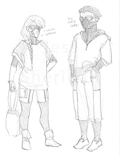
Doing a 30 day challenge over on my tumblr that focuses on costume/character design. I liked this sketch so I thought I'd post it here as well. This is from day 2.
Basically I wanted to create a simple, feasible design style which revolved around major environmental changes. Thus, breathing masks, heavy duty goggles, and almost completely covered bodies (skin-tight body suits with light layers over top).

Friday, November 09, 2012

Thursday, November 01, 2012

Redesign

Redesign of something old which I'm still kind of iffy on. Basically only kept the pants from the original design and redid everything else. Definitely some heavy Mass Effect influences (seeing as how it's been the life blood of my household lately). Tried new things with the lighting which I'm liking.

Thursday, October 04, 2012

Amelia

Amelia being a BAMF. Still not keen on the armour details. I normally keep her designs really simple but felt that her armour should have a bit of detailing. Ho-hum. Technically it should also either have a head covering or war mask but neither worked in the illustration.

Edit: redesigned the armour. Still have my issues but I feel it's more balanced and consistent with what I want for this style.

Wednesday, September 26, 2012

Adrian


Pair of illustrations of an OC, Adrian. Left, the canon design and right, a modern design spawned out of a K-pop fuelled night of drawing. I plan on doing another of these for Adrian's mentor, Amelia.

Adrian's a bit of an attention whore. Lots of tattoos in both versions and hair cut to emphasize the large tissue damage to the right side of Adrian's face and shoulder. Adrian doesn't really like clothes, but the canon design mimic's Amelia's clothes (because Adrian idolizes her and totally wants to be her). In canon Adrian tends to walk around with little to no clothing because, seriously, fuck that. Modern design... well, it's about as naked as a person can get while still being stylish and not breaking any laws.

Tuesday, September 18, 2012

It's your old friend, deadly neurotoxin.

Some fanart for a change!

GLaDOS - Portal series
Last week my drawing group had AU (alternate universe) as its theme. I decided to actually do the theme for the week and drew an android version of one of my favourite villains/potatoes, GLaDOS. I worked with just her original design, specifically the white plates. 
Also trying to start creating more graphic illustrations even if it's just a character study. I plan on working with the style more over the coming months.

Saturday, September 08, 2012

Space suits - girl armour

Finally finished this fucker. I redesigned this about five times and completely redid the overall layout and most of the lines over the past few days. This is what I get for trying to draw something so complex when I'm out of it for several weeks. Oops.
Originally I intended to have her and her male counterpart (who may or may not be drawn later) as military-ish figures but she looks a lot more like a cop. I'll be doing a weapons study later. I wanted to do something different that the sci-fi gun standard and came up with a multipurpose energy weapon (katar-like blade, taser-punch, energy shooter, shield, and mass-damage ball and chain type weapon). Looking at it here it's way off scale.

Friday, August 03, 2012

Impractical outfit

Inspirations - Eva Unit 01's shoulders, anime styles in general, Helba from .Hack
Trying to push myself out of everything must be practical and/or simple and get into more complex stuff. As a result this ended up happening and it feels so teenager, ugh, but at the same time yeah! I'm not happy with the bottom half but that's mostly because in the sketching stage I was not thinking at all about the colour layout and paid for it later. I do, however, very much like waist up. I might mess around with this more later.
She needs a lance. If she belonged in a JRPG she would so be a lance person.

Thursday, July 26, 2012

Space suits -boy

I have very little to say about him other than he took a hell of a lot less time that the girl and that I really like his pants. I'm seriously considering making something like those in the future - the pattern would be really easy, it would just be sewing down the piping/ribbon/embroidering that would be a pain.
Clearly I need to learn a lesson from this and actually give a good amount of time to planning before jumping into an illustration. Time for the armoured suits!

Tuesday, July 24, 2012

Space suits - girl

New drawings! (i.e. ones that have been almost done for weeks and I only just finished because I hate doing line work and that was all that was left.)

Inspirations - patterns from Atlantis, swim suits, that hood of amazingness and wonder from Prometheus
Finally done. This is a continuation from the space armour sketch from a few weeks months ago. I'll also be doing a male counterpart as well as a proper illustration for their armour. I want to get a good, strong series of illustrations out of this for my portfolio to show design, character, and the ability to think through all the details.
Initially I was only going to do the armours but then I decided to get more involved in this. I imagine the base suit as a wear-all-day kind of thing made out of the magical fabric described by Edna Mode in The Incredibles. It would offer protection from the elements and from the armours; however, to allow for individuality the people in this setting wear easy to remove clothing over top their suits. That way if an alarm sounds they can get into their armours quickly and efficiently without having to completely change their clothing.

Saturday, July 07, 2012

Two parts of the same whole WIP

Today's the one year anniversary of my blog! To everyone who's visited over the past year, thank you! I was hoping to have an illustration done to complete this post but the past few days have been surprising to say the least.
This is one of two files I'm working on right now as stress relievers. The other file is done save for some outlining. This one is much more calming though I have a sneaking suspicion that once I begin to tackle the hair I'm going to be spurting out many expletives.

Monday, June 18, 2012

Photoshoppin' again

Haven't had the attention span lately to open up photoshop (much to the dismay of my entire self). I started tonight drawing in a different way than normal to get myself back into the groove and to get my head working. I find drawing jolts me into a good place when my head's foggy.

Inspirations - The Art of Tron: Legacy, Evangelion
There are actually three working versions and I'm kind of torn between which one I like best (I'm not as keen on the third/can't figure out how to continue with it). It's all on one layer so I'm trying to make sure I can go back if I fuck something up. Everything's done with the lasso tool. I really enjoy using it but often forget of its existence.
I've been trying to get out of my tendency towards fashion/couture/historical costume and more towards a streamlined look to get out of my comfort zone a bit more. I don't know if this counts as a success; I think I found a midway point with sci-fi couture instead of straight up different, haha.
I'm going to stop rambling now.

Monday, June 11, 2012

Correction

This is also part of my productivity levels yesterday. Right after posting last night and snuggling up for bed this decided to swim into my head. I guess when the only thing you can do in a day is sit and fester in your own head you come up with something eventually, even if it's not what you want (in this case, material for my Habibi paper).

Inspirations - the hipster's hood from Prometheus, Eureka seveN
The drape of the sleeves is really off, but it was 1am and I don't care.
On a side note, I loved the costumes in Prometheus. A lot of people seem to feel that they're too modern/too entrenched in modern styles, but I thought that was very appropriate considering the trend in minimal clothing changes over the course of the last few decades. I thought they were just that one step forward enough to work. The hood (cylindrical instead of a typical hood) was brilliant - a simple, radical change to something that is so common in everyday clothing. I'm smitten with it and it'll probably show up in my work a lot now (along with Mongolian-stlye boots and massive pants).

Sunday, June 10, 2012

Only productive thing I did today

Today was one of my not so great days. I've been rewatching an anime I really liked as a teenager (Eureka seveN) to pass the time on such days. Back when I was in my teen years it really influenced my design style - which was a good thing in my mind and still is. Even though the animation is shoddy the production design and attention to detail is top-notch. It's still home to some of my favourite designs even after all these years.
I realized the other day that my costume history and construction background, in odd ways, hinders my ability to design. My designs always feel so confined to the realms of reality and what I know could be created instead of just being a product of imagination. I'm really trying to get away from that. It's one of the reasons why I'm trying to revisit old influences and finding new ones lately.

Anyways, enough angsting. This is really the only thing I did with my day aside from a small amount of reading. Unfortunately it was sketched in non-erasable pencil crayon so I couldn't fix things I didn't like. I'm definitely going to continue with this style for the series so I'll fix those things then.

Inspirations - Eureka seveN, Medieval lappets, military coats, men's doublets (mid 17th century), bugs
Couldn't figure out what to do with the boots. I'll figure that one out later. I'd like to fix the lower portion of the coat so that it has a more complex hem. I think I'll have this (when finished) done in multiple layers of clothing (with and without the coat, specifically so I can show the waistline of the pants at the back). The guy counterpart should be easy. I like this style. It's really easy for me to work with, but feels more outside my normal boundaries.

Thursday, June 07, 2012

More sketches

Hello, all. Sorry about the lack of posting. Here's hoping that weekly meet ups with my classy lady artist friends gets me back on a somewhat normal drawing schedule. Unfortunately for the next month I'll be working on some papers from last term so drawing will be limited. However, during July and August expect a flood of drawings. I'll be working on several series to get some good portfolio work and be learning programs like Mudbox and Sketchbook Pro, which if you're a digital artist I highly recommend! It works like traditional drawing mediums so it's great for sketching and lines. Here's hoping it helps my atrocious digital line work.

Anyways, here are some early sketches of the series I'll be working on. I'm planning on doing a guy and girl in various styles of clothing to show my range.

 Inspirations - Prometheus and Mass Effect, skeletons
Space suits which will probably get full colours in the final designs. Girl front and guy back; very similar designs but blockier for the guy suit.
I might also do environment sketches for this pair as well. I find it funny that in every SPACE! series it's all metal and there's no natural environments. It's like everyone assumes that in order to have excursions in space humans had to have killed the planet prior to the beginning of the series. Silly.

 Inspirations - the Equalists in Korra and Iron Man's hand blaster, Mongolian boots (my love and joy), the hoods from Assassins Creed
Nothing to say. Trying to figure out a boy counterpart that's substantially different. This one feels pretty comfortable for me. I'm going to be trying to get away from this kind of design with the others.

 Inspirations - hairstyles of various Native American tribes and the hair of Amy Dorrit's sister in BBC's Little Dorrit
I think the clothes will end up a lot more Japanese even though these started out based on Native hair styles.

My good friend, Kat, just finished her fourth year and her thesis film. I finally got to see it properly on Saturday at the Toronto Youth Shorts Film Festival. I decided to do a quick sketch of the film's main character, Maki. I assure you Maki's a very lovely young lady, I just really like her as a pissed off snake. This is, for the record, about as cartoonish as I go.

Wednesday, May 09, 2012

Sketches

Drawings! I haven't been able to draw lately but here's a few sketches from this week.

Inspirations - I'm not quite sure at the moment, but I'm tempted to blame the large amount of BBC I've been watching since mum invaded. Also a pair of earrings from Oscura, which is a wonderful webcomic that has a very sketchy updating schedule.
Pencil
I'm not sold on the sleeves but I'm liking the head/shoulder area. This is one of those "damn it's 2 in the morning and I was just about to fall to sleep now I have to tumble out of bed to find the sketchbook before the idea leaves and gaaaahhhh why does light hurt so much" drawings. I'd like to work on it more later.

Korra from Legend of Korra
Ballpoint pen
Began sketching this while visiting my dad's shop on Saturday. If you haven't tuned into LoK yet you really should. The series is incredibly well researched and has some amazing production design. If you're a fan of fantasy, Asia, or the Roaring Twenties I cannot suggest this series more highly. I'm going to stop being a fangirl now.
My ballpoint pen skills are lacking. I really need to work on that. Clearly I am out of practice.

I'm hoping that I can get back into the game again soon. I'd like to finish the series started last week (and fix that illustration), get some character designs done, as well as some environment designs, and start experimenting with styles again - I'm not in a rut, but I do feel like I need to up the ante again some time soon. Also, please excuse my loopiness/rambling.

Tuesday, May 01, 2012

Modern Sweethearts WIP

I'm back, for the moment at least. I'm working on a series of illustrations based on a painting style I developed back when I first started using PS. Here's the first which still needs some love before its done. I also need to do a print test to see if it prints well.

Modern Sweetheart
Inspirations - a painting from a waiting room (colours) and victorian pendants
Today and yesterday, CS5

Tuesday, March 27, 2012

Mini post

Hey everyone, I'm not dead, just a bit under the weather. I probably won't be posting as frequently over the next month or two. Such a drag as I was really in a good groove this semester. Anyways, here's a couple of sketched done over the past few weeks.

Inspirations - birds, always birds. I love those little guys, as if that wasn't obvious by now. African wooden masks as well as pretty much any kind of mask that I've encountered in my trips to museums like the ROM and the Menil Collection.
Red col-erase, 2 weeks ago?
Amelia's face is off in the profile. Her jaw does not look like that. I'm not sold on Rodrigo's owl mask. I think I'll be fiddling around with that one some more.

Inspirations - mongolian boots (because they are so incredibly awesome), the hair styles I came up with for the Rapunzel pair, some old sketches
Red col-erase, 1 week ago
Been writing a lot for the All Hail universe thanks to the short story I'm working on for class. I decided that I needed a good look for the Northern Tribes that was very different from the look of Sentrans like Amelia, Rodrigo, and Adrian. I ended up using a lot of old sketch ideas and working with simpler, more angular lines than the puffy Sentran look. Lots of layers of wool to combat the cold. I think I need to incorporate the design on their boots into their clothes more.

Thursday, March 15, 2012

Thursday afternoon update!

Have a BAMF in high fashion!
Inspirations - a girl in a yellow coat walking outside my classroom yesterday
Not much to say - I like this lady. I think I might have to do something with her later.

Thursday, March 08, 2012

Have something happy

I had a bad week. So I drew something insanely peppy and happy. Basic colours blocked out and thats about it.  I've hit the wall so this is it for tonight.
Probably won't stick with these colours; I'm working in CMYK because I'm tired of how poorly everything always prints in RGB, but this version here is RGB, so there's some colour differences from the working file. Debating whether to put a cityscape in the background or some sort of natural setting. Possibly just a funky design. Gah. I hate backgrounds but I really need to get over that. Too tired to write anything more. Oodles of love to everyone else who has had a bad week.

Also, this is the 50th post. Thanks for following or simply stumbling upon my little art blog. <3

Saturday, March 03, 2012

Bechdel Test

So, this started out as a simple parody and quickly became lots of fun and pretty good design/layout practice. I know my parents and possible friends of family are going to find this, and to them I say, if Hans was a girl no one would take a second glance. That's why I made this, to point out the baffling disparities in the roles and portrayals of men and women in movies.

Tables Turned 01-Bechdel Test
Inspirations - action films, the Bechdel test (google it), 5 man bands (see previous post in January),  TVtropes, Vasquez from Alien, Gendo Ikari from Evangelion, Ethan Hunt from Mission Impossible, hamletmachine
So, anyways, you've got the leader, the second in command, the brains, the brawn, and the "chick". As a friend pointed out, this team is also really diverse. I can't stand the over-representation of white/caucasian persons in media so the team is also from various parts of the world. I have to thank my friends for helping me come up with these names, you're all so wonderful!
For anyone wondering, yes, that is insanely fine print on Hans' right thigh. It says "We don't know. He sleeps with the main character and then we stuff him in a fridge. What else are we supposed to do with him?" I could not bring myself to fail at anatomy and put him in the standard boobs/ass pose you so often see with girls. Instead you just have an over sexualized pretty boy.
Edit: Fixed Hans' chest. A lovely friend pointed out an anatomy issue that I wasn't aware of prior. I think things are still a bit off, but then again, I've never actually seen a buy with this body type with his hands about his head. All my models have been older and done pretty masculine poses. I'll have to ask a guy to pose like this the next time I find a shirtless man of similar body type.