Saturday, December 10, 2011

Paper break

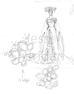
I drew tonight. I'm going to blame this on my recent revival from the dead (been sick), that class is over, and that I hate papers. 
Inspirations: bustles, intertwined fingers, dreads, punk and sci-fi, the basic colours on CS5 because I haven't added my old palettes from elements to it yet
Tonight
Beginning of what will probably be an illustration. Liking it thus far. I'll probably add more to it during my little breaks between papers over the next couple of weeks.

I've noticed that almost all my drawings are of women. This isn't intentional, it just kind of happens. :/

Thursday, December 08, 2011

Faces and sketches

Hello all, been busy and had very little time to draw this semester. Classes ended yesterday but I've still got a week and a half before the end of exams. Posting a bunch of sketches from the semester. Nothing much, but it's something. Hopefully the break and coming term will allow for more drawing time!

Dec 1st
Got CS5, which I am very happy about. This was my first test sketch in the program. I'm loving the brush dynamics. Entirely done on one layer with one brush for paint (black) and one for erase and lots of alterations to the shapes and size of said brushes. I'm really looking forward to seeing what it can do over the break.

Life drawing
Late Nov. - yesterday
Been drawing people a lot. I often draw my classmates when bored in class, but I've been taking out my sketchbook a lot lately to pass time. The first set are from a coffee shop (top right was a guy at his computer and the rest are of my friends who are unable to stay still unless concentrating on pokemon). Second and third pages are just random people studying or texting. 2-10 minutes a piece.

Notebook doodles
Sometime in October? Before I stared the illustration from the previous post. A bunch of doodles of Adrain and his various hair lengths (he chops it off himself, which is why it's never even). Messing around with angles and trying to get a firm grip on his jawline, nose, and how well the right side of his face can work (because of the scarring). Also a rough sketch of the illustration from the previous post.

More notebook doddles
Inspirations - period waist/tailcoats, AtLA's clothing, geishas, middle-eastern clothing
October or November
Doddles of another character from the All Hail canon, Alia in her royalish clothing. 

The Animal - The Fountain
October?
Drawing of the Animal from the short story The Fountain, drawn on the actual photocopy of the story I have. Described as a dog-like being the size of a horse, all white and shaggy, with cat's paws. I'd like to illustrate this properly later.

Tuesday, November 22, 2011

Personal Projects

So. Little time for drawing lately and I've spent next to none of what I have doing costumes. Thought I'd do a post with some personal projects, sketches, and half-done illustrations for the hell of it. For those interested, it'll probably give you a bit of insight into how I draw.

Rowan - Rowan and the Spider
Almost finished panel for pg.2 of Rowan. Her hair is the most painful thing to cel-shade ever. I spent 3 hours drawing with friends at a cafe last night and spent most of it (the parts I wasn't laughing so hard I had to put down my pen) working on her hair.

Adrian - All Hail (part one of a pair of illustrations; the other is a colour swapped version with Amelia, see her below)
I did most of this in about 2 days after class and haven't had time to pick it back up. I really don't like how much white Adrian puts on a page (not a big fan of lots of white). He's so awkward in that sense. Mostly another colour/light experiment (which I do love on the other hand). I need to fix his jaw. It looks far too like Robert Pattinson's.

General Rodrigo Al Sayid - All Hail
Clearly this is half done; I only properly shaded his face, everything else is just blocked. I really like Rodrigo, but he's only scheduled to be in All Hail for a couple of chapters. I draw him from time to time just for the hell of it.

General Amelia Mondego - All Hail
She makes a come back from the first post! The other day I decided to do a series of sketches for all the layers of her clothing (knickers to normal clothes to armour). There's another 2 that need to be done. The first is just binding and shorts; second, under-armour (leather and wool) for battle; third, house clothes. I've slightly altered her design again. After doing the line up last year I realized that the current design stuck out from the overall direction. Now her hair is in a side braid, neckline is a straight slit, and her pants are extended with a cute slit hem at the ankle. As always, missing her left arm. It makes her so lopsided!

Amelia variations
Done for laughs (mine) while at coffee with friends (on the back of a tray sheet). The first and third are "Anime Amelia", larger boobs, more skin showing, cybernetic arm, long flowing hair, and a rounder face (younger too!), etc. Second is a poorly executed "American Mainstream Amelia". Why is she a boy? Because, like Marvel or DC would actually have a badass female character missing an arm; all their ladies have become walking sex objects. I have, however, faulted, Man!Amelia would have to be bulkier if he was in a proper America series.

Monday, November 14, 2011

I'm alive; I'm just busy!

I still live and what-not. I've been busy with school work and illustrations/comic pages (I've joined a comic making group on campus, what joy). I've been doing very little costume/design work as I've been working on larger projects with my spare time. Here's a few drawings I've been working on. I've got a backlog of old drawings to scan, I'll get to that soon.

Rowan and the Spider - "Rowan and the Spider"
Inspirations - very little actually, wait no, nothing comes to mind, that's a change.
November 2011
Character sketches for a comic I'm working on. It's a 9 page story about Rowan, a young girl, based off a story I wrote for my creative writing class. I wrote the story in late October right before Halloween and really liked it, so I decided to make it into a comic for my group's publication. Thus far only one page is done. In case you're wondering why Rowan's naked (SPOILERS), I've never understood why people's clothing goes with them in the afterlife so she's naked in the comic, obviously her body will not have detail beyond outlines and a bellybutton seeing as how she's very young.

Inspirations - birds, women, you know, the usual, and the Tortall series by Tamora Pierce
October 2011?
Sketch from late one night continuing my never-ending obsession with birds and curvy ladies. I'd like to paint this one some time. Or possibly make something about her. I really like her. We can ignore the fact that birds are not mammals and therefore should not have mammaries, or hips for that matter.

Inspirations - Chinese and Korean clothing, pleated gowns, a skirt from the Qing Dynasty
Sometime in the last couple months
Another late night drawing, one I forgot about until I opened the notebook next to my bed to draw the bird lady. It was before the monk lady from back when I started this blog... so... June? Another drawing I'd like to paint (maybe digitally). Palette of purple-red, black, and gold.

Monday, October 31, 2011

Happy Halloween!

No drawings today. I've got a costume (partially made) which I haven't uploaded to Haydee yet. Just wanted to wish everyone a happy halloween before it was over, fitting since this is a costume blog. I also just wanted to say how odd I find it that these days you have to go as something, particularly something or someone tied to some sort of pop culture... thing. A costume's a costume, and I'd much rather prefer something original and interesting than a from the box slutty costume (this is, of course, coming from the girl who dressed up as a corvid this year). Anyways, ignore my meanderings if you wish.

I'm sorry about the lack of updates for anyone who follows this blog, if there are any. Been busy and, quite frankly, been thinking that I'd like to spread my wings and work more in illustration than strictly costume design. A few of the illustrations I've been working on might make their way onto here soon. Same format, but different content.

Hope everyone had a spooky night and that your tummies aren't too bloated from mass candy consumption.

Sunday, October 02, 2011

Another mini-update

Slowly finishing:

See Sept 17th's post for previous version.
Finally got the skirt working. It took a long time to figure out the right balance, but now I love it. Once this is done it's being added into the "most likely used for future portfolios" with Geisha Cleo. The colour palette on the side is barely accurate anymore.

Monday, September 26, 2011

Geisha Cleopatra

Been busy with school work, and with school work comes boredom and the need to draw. Did this today after a set of rather uninspiring classes.

Inspirations - "What else is there?" by Royksopp, Cash Back, that snake woman sculpture that's really, really old, Geishas, Cleopatra (reading Antony and Cleopatra by Dryden), "sketch-WIP-etc-duct-tape-idk" by NorthernBanshee, a pencil skirt worn by one of the girls in St. Trinians, the Geisha dolls in Ghost in the Shell, art nouveau
Sept. 26th 2011
Thus far, one of my best and most balanced designs. Done in about an hour and a half following class today. Not much to say. Probably will end up being a main portfolio piece.

Saturday, September 17, 2011

Mini-(up)date

Here's a WIP. Currently stuck on the skirt pattern. The whole design started when I thought of a skirt with that pattern but I'm not sure if I like it with the rest of the outfit.

Inspirations - Art nouveau, Victorian clothing (no period specifically), the pattern on the skirt, harlot characters, fans
Sept 15-16
Started with the skirt pattern and colours and got stuck. Ho-hum. Definitely one of the most complex designs thus far and not normally me. I'm liking it but need to get the skirt to work. Ideally her ankles would show, but I do love how Victorian skirts hit and lightly touch the floor. Choices, choices. 

Bit of a joke: If this was for a movie, this would be such Oscar bait. Vaguely Victorian inspired theatrical costumes for sexually active and angsty women! How could the Academy not fall madly in love and declare them the best costumes of the year! Iamahorribleperson.

Tuesday, September 13, 2011

So, have you figured out that I like tutus yet?

Hello all, sorry for the lack of updates. In my weeks off from class I had my summer's life condensed into a few very packed days of constant interaction. Class has started again so I should have a more structured schedule again soon and hopefully I'll get out of my funk that I've been in over the past couple of weeks. I feel like my work's getting really repetitive and drawing from too few concepts and styles. I need to nest myself in the GT500-1500 section of the library again soon (costume history section). I'm getting very anxious since grad-school applications are soon and I need my portfolio to be excellent. If anyone has any suggestions I'd greatly appreciate them, I like criticism.

On a happier note, I've begun work on a costume for Halloween (which is very serious business). I started draughting pattern pieces the other day and hope to get a mock up and possibly the beginnings of one piece of it done this weekend. *fingers crossed*

Anyways, as promised in the title, tutus:

Odile - Swan Lake
Inspirations - Black Swan, feathers, gold
Aug-Sept 2011
Please excuse the horrible background and complete lack of a single light source - I got carried away and I feel like I lost the design behind the rendering. Not much to say. I like this one but would like to draw it again in watercolour so it works better with the VonRothbart illustration done a few weeks ago.

V. 1 updated
I changed the base top-plate colour to work with the rest of the tutu better. I had V. 2 as my background on Haydee (laptop) for the longest time. V. 2 was far more balanced, but I felt like V. 1 had a far stronger top, so I balanced the top-plate better to suit it. I think this works a bit better (I hope you agree).

Monday, August 29, 2011

New Orleans

Been down South visiting the 'rents for the past week. I finally had some time to draw today on the flight back after a long exam period following by visits. We went over to New Orleans for a few days and I found the atmosphere to be quite beautiful. This is one of three designs that popped into my head while there.

Family Vault
Inspirations - Lafayette Cemetery 
August 29th 2011
We stopped off at Lafayette on our way out. I spent a long time wandering through the old vaults that were breaking apart and over-grown with moss or plants. I fell in love with the form, the cracks and breaks, and the plants growing out from the walls and roofs. This is more or less a combination of those things.

Saturday, August 13, 2011

Swan Lake

One of two illustrations I'm working on right now from Swan Lake. The recent essay on Black Swan that I've been writing all summer can totally be blamed for this (and all the tutus I've been drawing).

Rothbart - Swan Lake
Inspirations - masks, birds
August 13th
Watercolour; finished illustration from the sketch previously posted. I don't have anything to say about this I guess. If it wasn't obvious by now, I really like masks and birds. Also puffy sleeves and pants. I really need expand my designs in different directions.

Sunday, August 07, 2011

I know kung-fu

Busy writing papers, but I worked on this between classes and on breaks.
We can totally ignore the proportion issues and off-balanceness of everything. Yes. Most definitely.


Inspirations - monk lady from previous entry, various East Asian monks, geometric designs, parkour, inadvertently, Tony Jaa and Stephen Chow
August 2011
Came up with a sort of spiritual successor to the monk lady from a month ago one night and decided he needed an epic action pose. Somewhere along the way he took on a look more akin to a modern martial arts star than a monk, funny how different faces and hair styles do that, but I couldn't bring myself to erase his face. Definitely more of a hollywood kung-fu style than originally intended. I'll post the little thumb nail sketch I based this off of in my next sketch post.

Wednesday, August 03, 2011

Sketches

Some more sketches from my sketchbook. I kind of forgot about it this past week and a bit (and the various drawings I'd done in it), whoops. Things discovered today: my favourite pen hates the paper in my sketchbook and my scanner hates scanning my sketches well. All sketches about 5-10 minutes.

Snow White and Rose Red - "Snow White and Rose Red" from Grimm's Fairytales
Inspirations - lace, bloomers, frilly things
Today
Been thinking about this one for quite some time. Even though I got the bear character down fairly quickly the twins caused a lot of trouble. I experimented with a large number of designs, mostly girly dresses, for the innocent Rose and Snow, but nothing worked. I knew I wanted to have them in something where both would be wearing the same outfit with a palette swap or an addition of red on Rose Red's clothing. Today, while in Early Mod Phil (like always), I began playing with the idea of something lacy, but not a dress since I feel that 'innocent child in a dress' is way to over done. I like the outcome of bloomers with a lacy top. Lots of cut-work at the hems of the shirt, bloomers, and sleeves, with lace sewn in layers at the collar. Ribbon at the knees, elbows, neck, and around the waist (only showing in a small bit on the front and tying in the back). Better illustration to follow at a later date.

Inspirations - birds, Atlantis, saris
summer 2011
Counterpart of the woman from my first post. Not much to say. The scan lost the images of her mask next to her. It was a long, angular, and skeletal bird mask.

Major Kusanagi - Ghost in the Shell
Inspirations - Ghost in the Shell (1995 film)
Tonight
I'm a big fan of cyber punk films and a moderate fan of the Ghost in the Shell films and series, mostly because of the Major, the setting, and the philosophy behind it (I'm actually tempted to say that the philosophy of the mind and machines seen in many cyber punk works is what drew me to philosophy). This isn't really a costume design, or at least I feel like it's a cop-out to say it is, since I was just sketching something based on a pre-existing design and character. Mostly just feeding my love and desire for the cyber punk style. I'd love the opportunity to collaborate on a cyber punk project in the future, but I feel as if the genre died with The Matrix.

Monday, August 01, 2011

Roaring Girl

Took the weekend off after (and between) paper hell. Been on a Hans Zimmer craze; I have nothing but love for his music. Spent much of it in a Dark Knight and Inception fuelled drawing spree to get Moll done before heading back into the depths of libraries and Microsoft Word.

Moll (modern version) - The Roaring Girl
Inspirations - Jeffery Kurland's designs for Arthur in Inception
July - Aug 2011
Modern design for Moll; I think that despite its age, The Roaring Girl would make an excellent play set in modern day. The play itself is a social commentary of the early 17th century treatment of women in England and Moll, the protagonist and titular Roaring Girl, is a cross-dresser who stands up for women while dressing in very stylish men's clothing. Originally I wanted to have her pallet at a set of warm neutral tones and beiges, but using browns and beiges in my drawings is one of my greatest weaknesses. I must have gone through about 15 colour schemes before settling on the one seen here. Basically her clothing is just men's clothing fitted for a woman's form. Dark grey vest with gold lining and back, white shirt with English cuffs, a thin black tie, and lighter grey slacks. There are small, matching details throughout her outfit, like the small gold orb buttons at her wrists, as her tie pin, and on front and back hips. Buttons on men's side (left over right) with hand stitched button holes because they look so much better and are much classier. Dark grey men's shoes with a flat, long, and slightly curved toe. Also, I put a small shell clasp on her hair to add the slightest touch of femininity. 

Monday, July 25, 2011

(Most definitely not) the final tutu post

On a bit of a tutu craze. Finished tutu V.2 during the breaks of Early Mod Phil today.

V.2 finished
Inspirations - kimono neck lines, Chinese tops, inadvertently, peacocks
July 22nd - 25th
Not much to say. I really like this one as well. I originally (during the messing around with it today) tried a rounded bodice hem like on Chinese tops, but it really doesn't translate well to tutus. I understand why the standard hemline is pointed, slims out the torso.

Saturday, July 23, 2011

More tutu action

V. 1 finished (?)
Inspirations - kimono neck lines, folded tulle
July 21st and 22nd
Fixed the bodice hem line to suit the top plate better and added a little bit more detail work on the top plate to balance everything. Really, really like it. I rarely begin a sketch without a lot of prior thought or planning, so this was a fun exercise. I find it really easy to experiment with photoshop, but I've been holding off using it for the past week  or two (many costume design masters programs greatly prefer traditional drawings). I've been having problems finding a happy medium since photoshop offers speed and a high level of experimentation (case in point, above). Anyways, enough rambling about that, I will probably finish the other variant later. Also, please excuse the lack of rendering in respects to her body; I really just wanted to focus on the tutu (though her face ate up some time and love).

Now, if only I came up with this design a month ago, I feel like this one is far superior to my submitted design. Ah well, my boundaries were pushed and good things came out of it.

Friday, July 22, 2011

More tutus

Continuation from yesterday's post:


 V.1
Finally figured out a design for the top plate and then I decided that the bodice wasn't working, thus I began this:
V.2
Took a more oriental design approach. I feel like it needs a dragon curling around the bodice.

Looks like I'll have a number of designs spawning from this exercise seeing as how I can't decide on a single design. Oh the results of no planning, how odd you are. 

Thursday, July 21, 2011

Tutus

I recently submitted a tutu design to a major ballet company for an exhibition; unfortunately it was not chosen (though it may still be published on their various websites!), but defeat only makes me want to work harder and push my boundaries more.

Ode
Inspirations - Odette and Odile Swan Lake, Black Swan, ruff collars, birds
June 2011
Tutu design that I submitted. Around the time I began working on ideas I started work on the Black Swan essay for one of my classes - the two projects quickly became intertwined. The idea behind it was the combination of both Odette and Odile. The intended fabrics would have been raw silk (bodice and basque), linen (collar), organza (sleeves), and tulle (tutu and detail work). The tutu and much of the bodice would have been worked with gradients or layers of tulle to create a feathered effect. 

Inspirations - kimono wrapping at neck; next to no thought process
today
Odd little thing I began working on a few hours ago; not sure how to continue. This is pretty much just an experiment in colour and shape. Liking it thus far.

Sunday, July 17, 2011

Fairytales and forest folk

I started reading some of Grimm's Fairytales a week ago and have been thinking about two stories since then, "Snow White and the Seven Dwarfs" and "Snow White and Rose Red" which I stumbled upon while trying to find the gruesome original story of Snow White - the second story has nothing to do with the innocent princess. I've given the better known Snow White little thought compared to Snow White and Rose Red which is an interesting little tale. There are only a few characters, the twin sisters Snow White and Rose Red, a Bear who is actually a Prince under a curse, the girls' mother, and a Dwarf who cursed the Bear/Prince. I started doing some sketches (in Early Modern Philosophy, oh what a horrible student I am) with the intent to try and make the Bear's clothing reflect the shape/proportions of a bear while still being typical human clothing to imply that he's not an actual animal. I also began playing with the idea of masks on the two men constructed out of wood and held together with wire; each wooden piece would be a grouping of muscles/a section of a face.

Dwarf (mask) - "Snow White and Rose Red"
Inspirations - Japanese demon masks for which the name escapes me, very specifically the mask/face of the River Spirt from Spirited Away, African wooden masks
July 2011
The mask would cover the cheek bones up and just the lower jaw leaving the actor's mouth exposed and the white teeth glaring. At one point the Dwarf's eyes light up red; I'd like to see the eye socks glow red to mimic this. A long beard and stringy head of hair connect covering the entire face.

Bear (early drafts) - "Snow White and Rose Red"
Inspirations - Russian clothing, African wooden masks, Japanese kimono (wrapping at neck)
July 2011
Lots and lots of drafts for the Bear character, these are maybe a third or a quarter of them. Only thing that was settled with all for them was that the crotch line had to be low and the sleeves had to be dolman to mimic a bear's proportions. Hands wrapped in black cloth leaving fingers exposed to mimic a bear paw with extended claws (either pale hands or white gloves underneath to act as the claws). There's also the first daft of the Prince design; mostly just continuing with the idea of lots of layers to the clothing to indicate layers of the person under them.

Bear - "Snow White and Rose Red"
Inspirations - same as above
July 2011
More or less final design. Made the overcoat shorter and looser at the front with a lowered curved front hem and a raised curved hem at the back which allows the under-layers to show (one at the back would have a tuft for a tail). Added wrappings on the feet as well in the same style as the hands. 

________________________ 


Inspirations - The forest people in Game of Thrones, antlers, winter
May (?) 2011
Older sketch which I jotted down after watching the first episode of Game of Thrones. I love the costumes for the Northern peoples (and the Dothraki as well). Clothing made of skins with a large fur collar, wing-like antlers at her back, and a bird mask. Not much to say. I'd like to work on this more.

I'm definitely in a mask-craze right now, ahaha. Also, I said "mimic" quite a bit. Clearly I am a very articulate person with a wide-ranging vocabulary today.

Tuesday, July 05, 2011

More sketches - historical (ish)

My Early Modern Philosophy class is tremendously boring, but I get good ideas and sketches out of it. I can only take so many hours of why God is the solution to everything, Malbranche.

Inspirations: -punk genres like steam punk, mediaeval clothing and armour, Mongolian boots, ball-jointed Japanese dolls
June 2011
Knight sort of man with a robotic arm that loosely works like an armoured arm powered by magic (or God, because as Malbranche has taught me, God does everything!). His pants should be just a pair of leggings. More accurate and looks better. Debating whether his right leg should also be robotic to a point. And yes, I have just suggested Mediaeval Punk. I don't even like the mediaeval period.

Moll - The Roaring Girl
Inspirations: historic concept - provided illustration of Moll in Roaring Girl, cavalier clothing of the 1630's, a pair of gloves from 17th Century Clothing in Detail by Hart
modern concept - Jeffery Kurland's designs for Arthur in Inception
July 4th 2011
Two ideas for Moll - if you've never read Roaring Girl there are plenty of online versions and it is an excellent play - one historic and one modern. Moll's character is very interesting. Masculine, but incredibly fashionable. I did an essay on her costume last winter; she's a forward thinking woman and it really reflects in her clothing. The illustration and descriptions peg her more along the lines of the costume found in the 1630's - over a decade after the play. While doing the sketch for the historical concept I also played around with the idea of a modern interpretation. I'm not sure how well it would work seeing as how she needs a sword at various points in the story, but.... Anyways, once again, a very sleek and stylish design. Both would be in neutral tones with small bits of detail work. Hair tied back with wisps at the front (love locks for the historical design). Both will probably be fully rendered soon.

Sunday, July 03, 2011

(More or less) finished illustration

Inspirations: Buddhist monks, Hindu patterns, mosques, summoner clothing from FFX.
June 30th - July 3rd
Can't decide on the pattern - or lack thereof - for the middle section. I feel like her ears need some gold earrings. This is by far the most complex design I've ever come up with. I'm finally getting out of my tendency to over simplify my designs. I'd love to see this one realized.

Saturday, July 02, 2011

Sketch backlog

EDIT: Removed some images as they were getting a lot of hits off Goggle. I feel that they were probably being misattributed and am not comfortable with them being up here anymore.

A few sketches from my current sketchbook (chronologically). For no apparent reason two sketches, the colour swatch sketch of Rothbart and a personal favourite sketch, refuse to load. Ah well, another post.

Rothbart -  Swan Lake
Inspiration: Black Swan, masks
February 2011
Sketch done on a plane ride home from Houston after watching Black Swan. Swan Lake was the first ballet I ever saw, so it has a special place in my heart. I greatly enjoyed Black Swan - I'm actually working on a paper this summer on the costumes in it. I find Rothbart's character is the one with the most room for interpretation. Odette and Odile always have the same rough tutu design, but different facets of Rothbart's character are explored in each rendition of Swan Lake. My design follows a more Byronic style with a hint of horror - better seen in the colour swatch drawing. Full illustration will be done eventually.
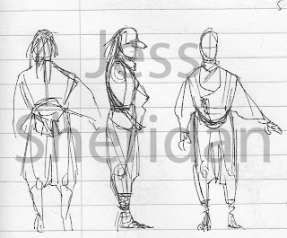
Inspiration: "The Powers That Be" from Angel, Yinyang
May or June 2011
I began watching Angel a few months back. The costumes are sooo dated. Never been a big fan of 90's clothing. The designs for The Powers That Be in an early episode of season 1 are... cliche to say the least. After seeing it I thought about the concept of "Powers That Be" or "fate" or "seers" and came up with this.


Inspirations: sci-fi and steampunk
June 2011
Came into my head one night. I see her as some sort of action girl sans the stupid black leather cat suit and high heels. Her hair ties around her head in a loose loop.

Inspirations: A book on tatting on my nightstand, Chinese hair styles 
July 2011
Not much to say. Another one that just popped into my head. The left doodle is a sketch of the tatted lace that would be at the hems of her skirt and sleeves.

Blog started

The costume blog of Jess Sheridan has now been born. Please bear with me as I figure out the design and all the little bits and pieces of this site. For now, here are a few sketches and illustrations to start this thing off right! They're all just ideas or things that popped into my mind. None of them are based off of plays, books, or other such works - those are mostly traditional and must be scanned.

Inspiration: Buddhist monks, Hindu designs/henna
June 30th-current
Design I began working on last night. Final version will be done soon. One of my favourite designs yet.

Inspirations: 17th century European men's clothing, Middle Eastern clothing
December 2010- January 2011
Amelia's one of the main characters for a story that's been going around in my head for a few years. I did this to see if I could create a continuous costume history with the following in mind 1. change in her status/wealth 2. limited advancements in costume style similar to costume changes prior to the industrial revolution 3. Amelia is not the most fashion conscious person in the world, nor does she care to show off her wealth. I feel that it was a moderate success, if anything the final design (the starting design) sticks out.

Inspiration: San from Princess Mononoke and Kida from Atlantis: The Lost Empire
Spring 2011
Subject of another odd little story like Amelia. To-hi is part of a 4 page comic thing I'm working on right now. She has a bird mask (not shown) that when worn turns her into a large navy bird.